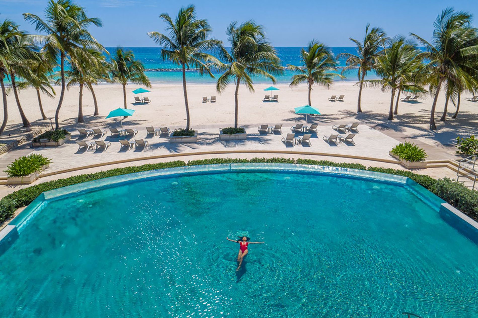
May 2023 will forever be a bold entry in the timeline of Sandals and Beaches Resorts' history. Actually, there will be two entries. One will point out magnificence: the Caribbean company unveiling its futuristic Sandals Dunn’s River resort, with Jamaica’s first beachfront sky pool suites overlooking an ocean too beautiful to be true. The other entry will point out a subtle transformation that towers over pools and can be held in the palm of your hand: the logos, refreshed and reworked for Sandals and Beaches Resorts.
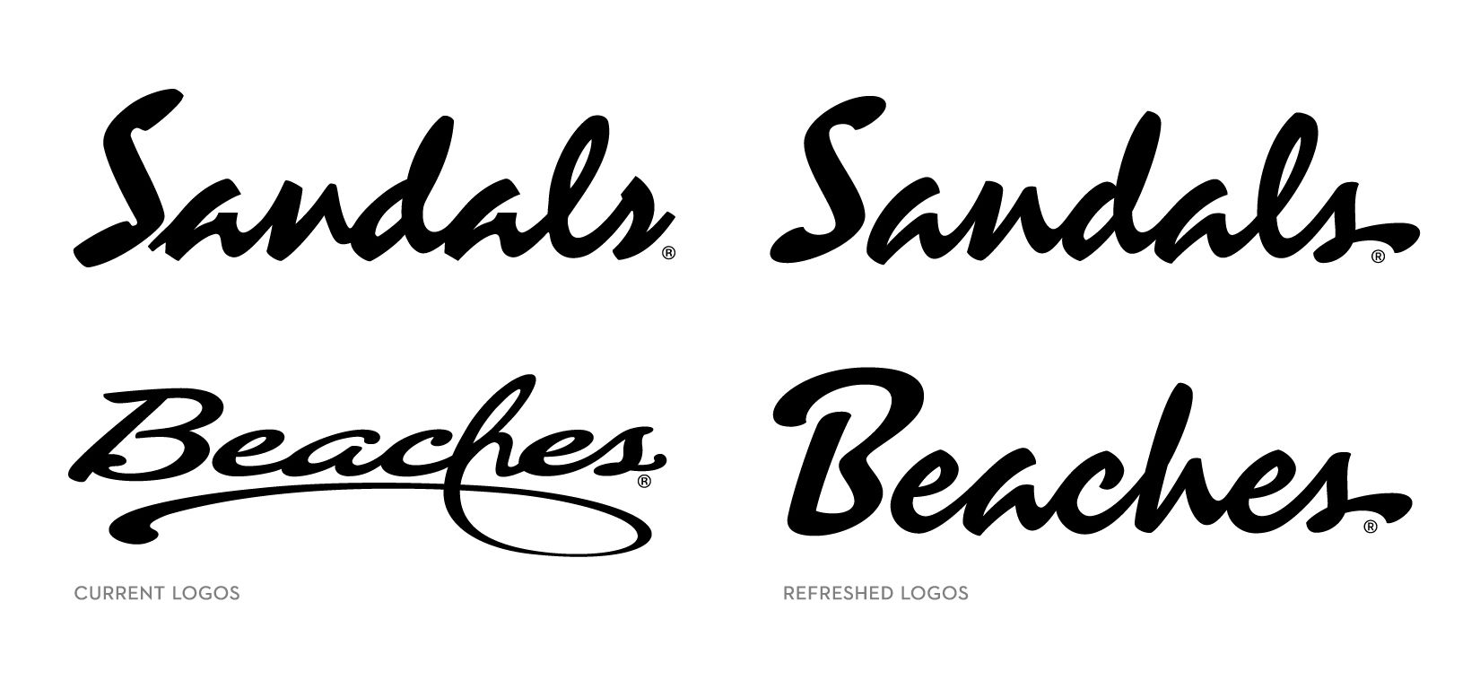
Photo: Pictured here to the right, the new Sandals and Beaches Resorts logos.
But there’s more to this than a hyped-up story about new logos — way more.
“The logos are not just efforts to change the status quo,” says Scott Peiffer, Sandals Resorts' Executive Creative Director. “There’s a much bigger purpose, and everyone should know about it.”
So, look closely. See the smooth edges in the lettering and the end strokes to wherever you want to go next? They’re connections, from the past to the future. From a couple coming to Sandals … to becoming a family and staying at Beaches. From the founder and original innovator, Gordon “Butch” Stewart … to his son and Sandals 2.0 innovator, Adam Stewart. From the resorts that have completely changed the Caribbean vacation experience … to the resorts that are changing them again.
The momentum from “then” to “next” has been gathering like a smooth wave across all Sandals and Beaches properties. The Caribbean-born company has unveiled new destinations, lavish new suites, new restaurant concepts, new uniforms, and newly imagined weddings, while quietly and carefully in the background the logos have also been undergoing remodels.
“We’re talking about iconic family brands built with an unmistakable DNA,” says Tony Cortizas, Chief Marketing Officer. “We had to be intentional about getting the logos right. It’s like owning a rare classic car. When you want something done, you entrust it only with the very best specialists.”
Pictured: The new Sandals logo can be seen from the sky adorning the Coyaba Sky Rondoval Villas at Sandals Dunn's River.
This is why Sandals brought in world-renowned architects to dream up the new Coyaba Sky Swim-up Rondoval Villas debuting at the brand new Sandals Dunn’s River. They also recruited the most sought-after culinary experts to develop flavors for the new resort including Edessa, Cascata, and Banyu. To re-imagine the logo lettering, they would reach out to another master craftsman: House Industries. You might not know House Industries by name, but you do know their lettering work for brands like Jimmy Kimmel Live, Los Angeles Tourism, Fortnite, and countless others. It’s impossible to replicate House Industries' designs because they do not use a font menu. Ken Barber of House Industries uses only his imagination and his hand moving about a millimeter a minute.
“I’d been thinking for years that if we ever went through a logo refresh, we’d have to do it the way we do everything else at Sandals and Beaches — at the highest level possible,” Peiffer says, “and House Industries and Ken would be the guys we’d want.”
The House Industries team has literally written the book on lettering (it’s called The Process Is The Inspiration), and Peiffer remembered Barber as the most influential instructor he ever had in art school. The class was typography, and Peiffer never forgot it.
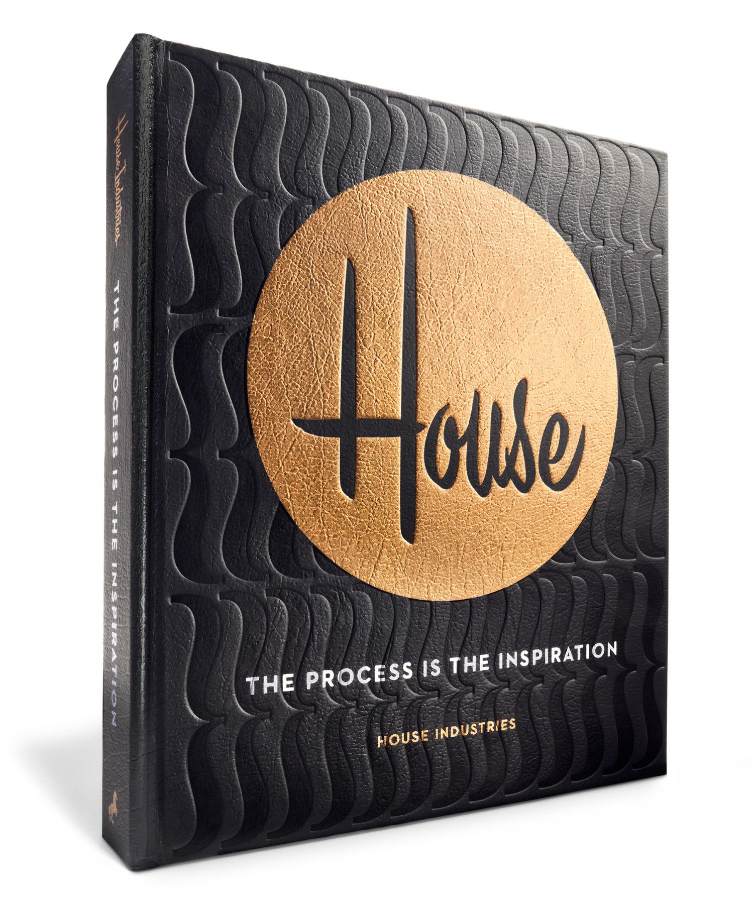
Photo: House Industries’ book is a beautifully useful 400-page volume on creativity, inspiration, and more.
“I’ve never seen anyone, before or since, who could create so much meaning and emotion with hand-drawn letters. For me, to go from a student 18 years ago to becoming a collaborator with Ken, working on a heritage brand such as Sandals … this has been a dream realized.”
Before he looked at the original logos, Barber did like the couples at Sandals and families at Beaches do. He looked at everything else. He saw a colorful ocean, relaxed guests, white sand, luxurious rooms, a smiling staff, innovations everywhere, and hints of family heritage.
“I noticed distinct footprints, born in the islands,” he says, obviously inspired by the sight of a beach right after sunrise. “We wanted to preserve that spirit as we moved forward.”
Photo: Vibrant brochure covers showcase the evolving Sandals Resorts logo throughout its over 40-year history.
When he researched the original Sandals lettering, he discovered it had always followed Butch Stewart’s courage to build resorts unlike any others. The original iconic Sandals logo took its breezy inspiration from a typeface called Mistral by a celebrated French designer.
“That was an interesting find,” Peiffer says, “because we realized from the very beginning there’s never been anything like it.”
And that’s exactly what they needed with the next version. Make the logos so smooth and clean that anyone from anywhere immediately sees Sandals and Beaches on a billowing catamaran sail, across the bottom of a pool, or on the side of a frosty rum punch. And when they see it, they’ll also feel it: pleasure, comfort, happiness.
“Perhaps most important, connect both of our beloved brands so Sandals and Beaches live in the same Caribbean family.”
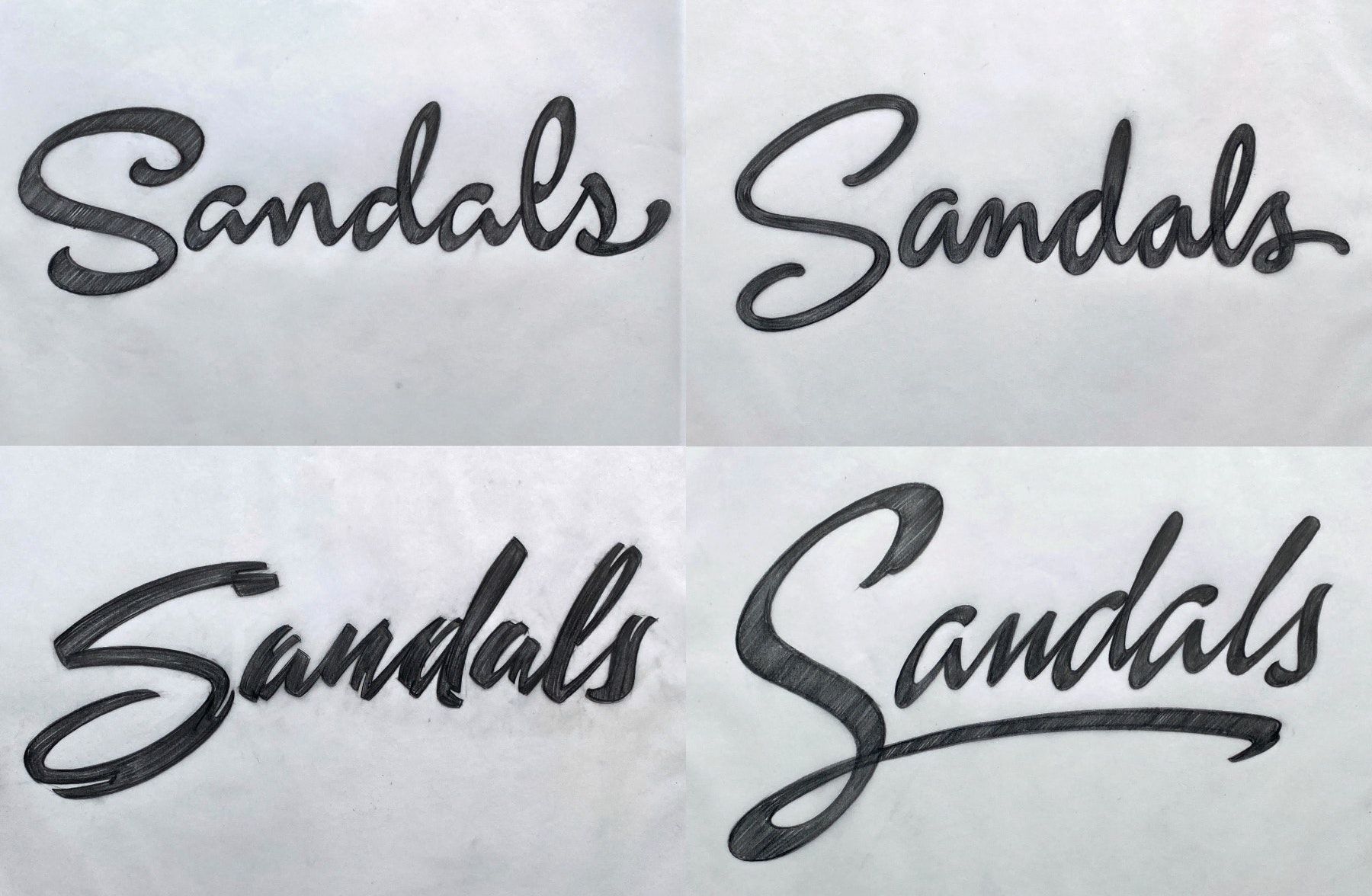
Photo: Freeform sketches of Sandals logo concepts.
With all of this in mind, the creative teams went to work. They tried flat brushes and calligraphy pens. Changed tiny square edges to microscopic round edges. Adjusted an angle to 3 degrees and re-adjusted to 4 degrees. They sketched. They crumpled. They sketched again. And scribbled. There were more than 100 iterations and conversations with the Sandals creative team.
That’s what it took just to get the “S” in Sandals right.
“The ‘B’ in Beaches took a lot more time than that,” Peiffer says.
Once they had the first letter in place, they found contours to declutter, weights to harmonize, a texture to soften, and gaps the size of a grain of sand to fix.
Think about it. If there’s so much care put into the profile of the tiny hole in the letter “e” and the stroke construction of an “l,” imagine what goes into finding the ideal comfort for a soaking tub or the perfect taste of an opéra pavé.
“Everything we do ties back to exceeding expectations of the guests,” says Cortizas.
Even nearly two years of re-crafting logos.
"It turned out that the marks were in need of a precision ‘trim,’ not an entirely new makeover,” says Barber, finding no irony in his personal analogy. “In the end, it was more like styling two individuals, providing them with the right aesthetic harmony to live as one.”
One, as in one love, one heart, one Caribbean family. With a little flourish at the end.
The flourish takes us back to the beginning, and to the future, on the north shore of Jamaica.
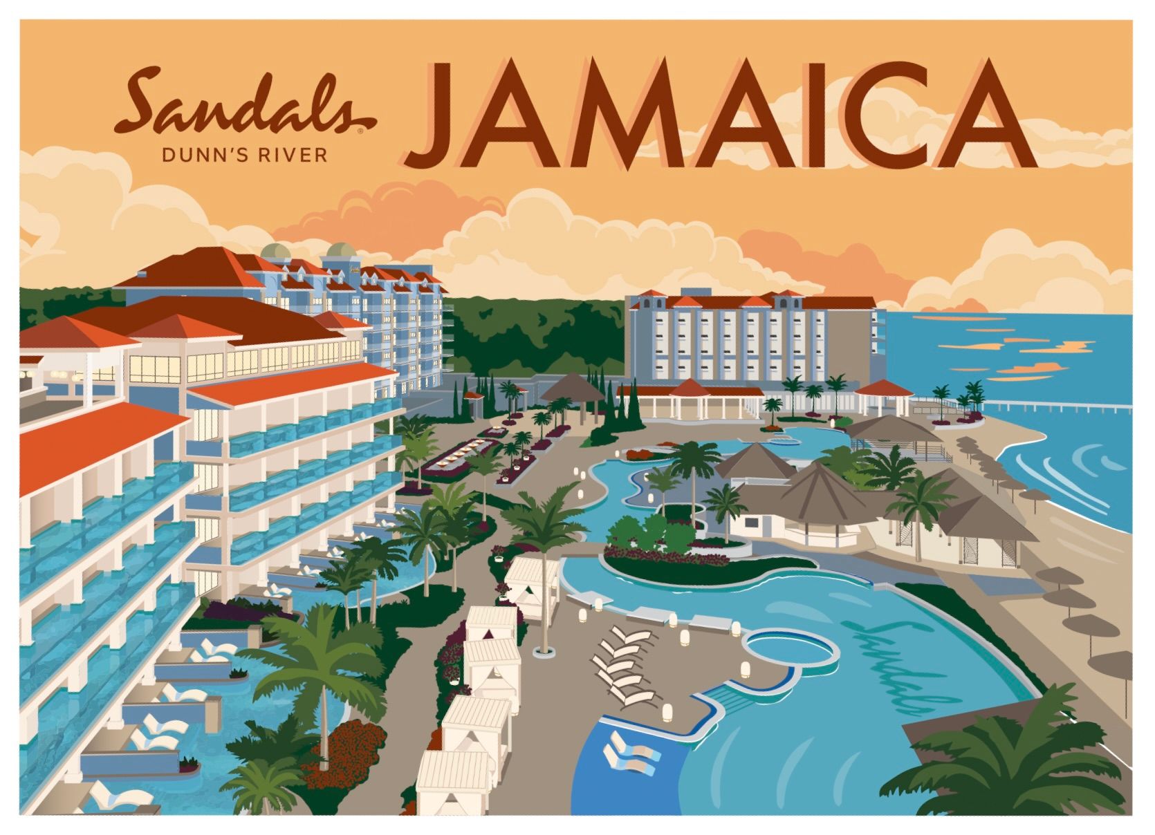
Photo: Sandals Dunn's River's nostalgic postcards nod to the iconic Arawak hotel.
There, the first guests of Sandals Dunn’s River are being introduced to the next looks of Sandals. How appropriate that it’s happening here. It would take only a few seconds to draw a line from where a couple stands on the beach to the exact spot where Gordon “Butch” Stewart became an entrepreneur as a young boy, catching fish to sell to that very hotel known as the Arawak in the late 1950’s. It would take only a few more seconds to draw a curvy line around the shoreline in the opposite direction, to a family swimming in the sea at one of the original Beaches Resorts, Beaches Ocho Rios.
Then we could stare at those lines the way we stare at a shushing surf or a logo and find meaning. See it in those lines? They connect generations. They remind us that “what was” continues to live in “what’s next.”
This is still Sandals and will always be Beaches. They’re just becoming better than ever.

 2 months ago
41
 English (US) ·